top of page

Clerate Hospitality
Clean solutions for the gig economy: Design for hospitality management
Designing a gig economy management app will revitalize the housekeeper shortages present in the hospitality industry amidst post-pandemic times.
When the hospitality crew has been selected, what management features will help to deliver a high standard of excellence?
The Challenge
Designing a gig economy management app will revitalize the housekeeper shortages present in the hospitality industry amidst post-pandemic times.
When the hospitality crew has been selected, what management features will help to deliver a high standard of excellence?
Goals

Never miss another important company message

Reviews insure that our contractors are the best in the business!

Get your crew all in one place, stay updated on their availability for upcoming jobs
The pandemic delivered a great setback to the hospitality industry.
Business models that once thrived were tested, and a catalyst for a new formula was inspired. How might we integrate a gig economy model with housekeepers eager to get back to work?
The answer is Clerate.
The Clerate app is a hotel supervisor tool that manages all essential task to run a smooth operation.
What is Clerate?
May 10th- June 7th, 2021 (4 weeks)
Timeline
My Roles
Wireframes
Prototyping
User test diagnostic summary
UI Design
Competitive Analysis
Affinity Mapping
User Interview
User Testing
UX Research

Clerate keeps your business running smoothly by eliminating the quality control issues before they happen.
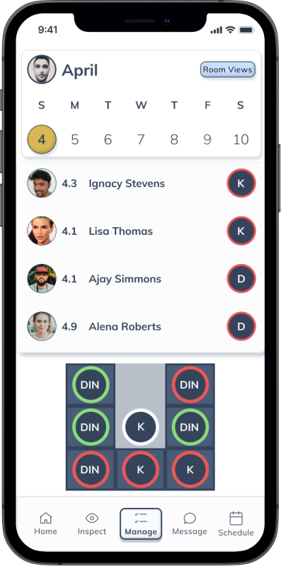
View who is on the schedule and where they are working.

View who is on the schedule and where they are working, with a real-time progress tracker
Event Holiday themes
The goal was to design a gig economy app that was portable and easy to use by the hospitality manager.
We learned from our comparative research that we could use bios, reviews, star rating systems, and security clearances to deliver a quality standard to the crew profiles.
The interviews and affinity mapping revealed that there were a lot of options to consider when designing for a service/ hospitality app.
Focusing on the scheduling would give the most dynamic solutions for designing a solid prototype in a short time frame.
The process of sketching key features helps to make the overall function of the prototype clearer.
Affinity Mapping Overview
After going through the responses provided by our interview participants, the feedback were placed into groups that would define the essential features of the app.
Affinity Mapping Interview results
Scheduling
Hotel
Independent contractors
Best rooms cleaned by
the best contractors
50 point checklist
Rooms to Clean?
Who is available?
Seniority & Top performers
assigned the upper tier rooms
Automation suggestions made
to the supervisor
Event Holiday themes
Diagram or line graphs of popular times in the dashboard
Forecasting & Occupancy
Miscellaneous
Simple & intuitive for young & old
Customize font sizes and backgrounds
Wireframes
A glance of the low fidelity wireframes that were the most impactful in the final design.
-
Scheduling
-
Rooms to Clean
-
Who is available
-
Forecasting & Occupancy
Scheduling

Rooms to Clean

Who is available ?

Forecasting & Occupancy

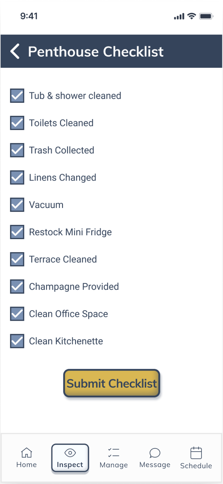
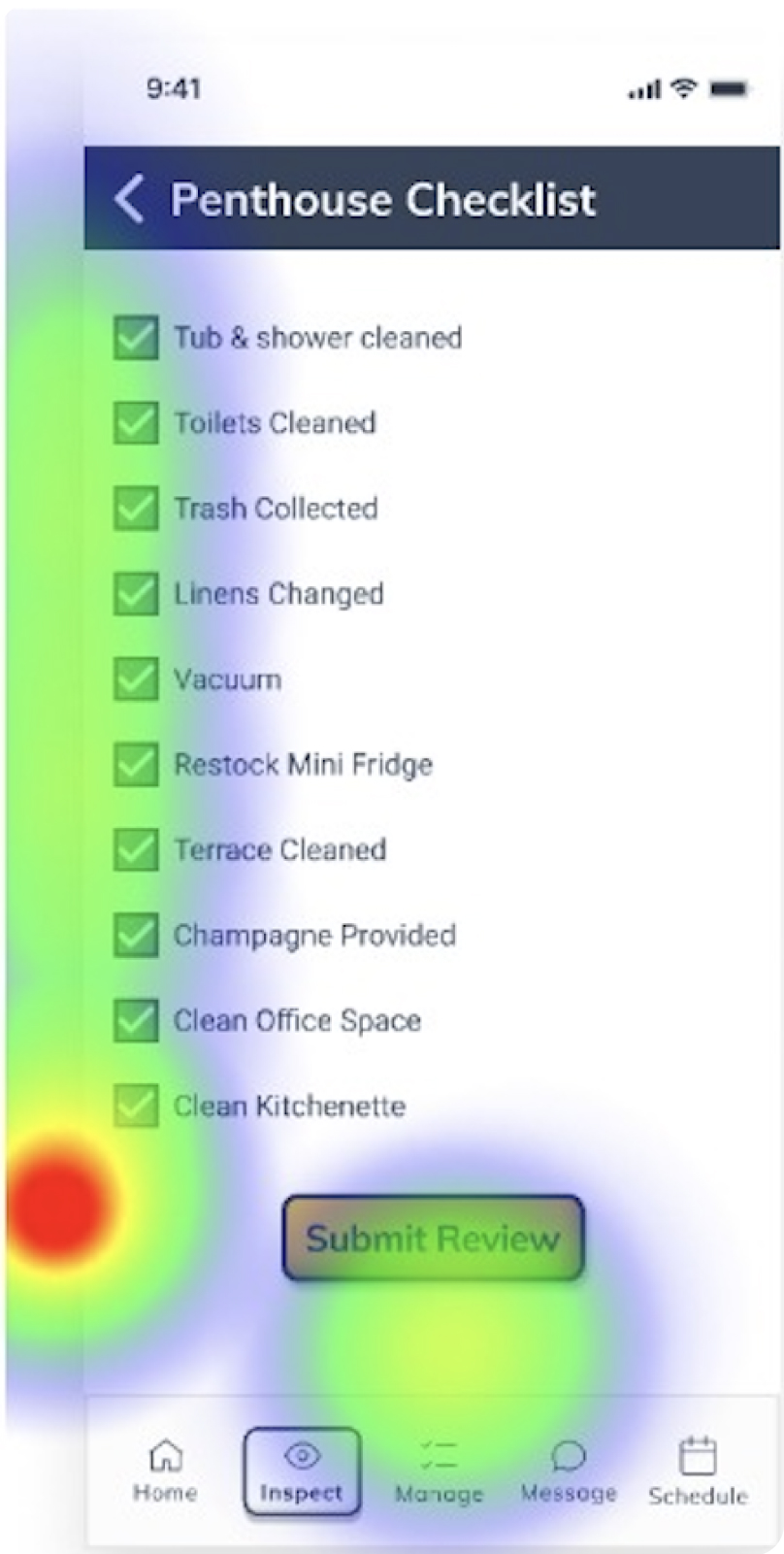
Using the inspect icon, complete the checklist for the penthouse and submit a review.
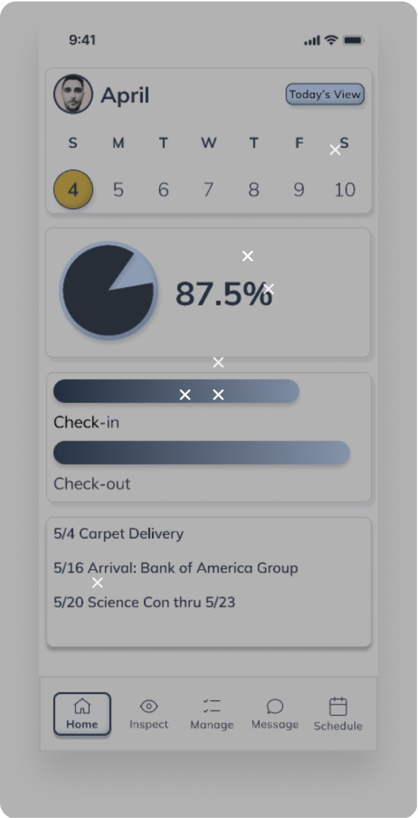
Instead of clicking on the instructed mission, participants wanted to explore the infographics more. However, this prototype was limited due to time constraints.
In further app development the infographic should lead to a more detailed look; giving the user a greater sense of control.
Another screen to watch revealed that the button for the checklist was labeled submit a review when the label should read submit checklist.
Before
After
Test
The Maze design diagnostic test was used to gain qualitative and quantitative feedback, which made our prototype app more intuitive.
User tests links were sent out to 14 participants that have experience in the hospitality industry.
Complete the app introduction section.
The misclicks on the first screen occurred because there was no link in the prototype connection.
The misclicks on the second screen occurred because the user was under the impression that to get to the next screen you just tap the screen anywhere, even though there is a next button on the lower right of the screen.
The proceeding screens indicate that the user understood how to navigate through the rest of the onboarding.

Final Thoughts
Working on the Clerate hospitality management app allowed me to experience many epiphanies in the design process.
Learning how to collaborate with a team composed of another designer and stakeholder.
Communicating and asking the right questions is critical to define what the main functions of the app will be.
Delegating tasks and playing to your strengths were also revealed. A team comprised of many different UX/UI design talents is far more effective than a team that specializes in the same area of expertise.
The quick turnaround rate reinforced that simplicity is the best option.
If there is a simple way to design it, choose that path.

Using the manage icon; locate the crew profile section, and find Melisa McClellan. Leave Melisa a review.
Users had a difficult time navigating through this task.
User feedback suggested adding a search bar. A search bar was added in the prototype.

Before

After
Following the app's feedback suggestions, Redesign the manage your crew section by adding reserves and cutbacks.
Eliminating the drop shadow and inner shadow of the instructions field should decrease confusion.
Adding elevation and inner shadow to the actual manage reserve button should also present some clarity.

Before

After
bottom of page